On this page

How do you choose an accessible font that can be understood by everyone? When choosing a typeface, it’s not as simple as referring to accessibility guidelines. Digital accessibility for text tends to focus on contrast and size, with little guidance in the way of typeface and font choices.  

For a deeper understanding of how to choose and style accessible fonts for more inclusive digital assets, purchase our comprehensive Accessible Typography Reference Guide.  

For a quick look at the accessibility barriers that typography mistakes can create, here are three common errors and how to fix them for a more inclusive and user-friendly experience.  

Typography error #1: Small or closed typefaces  

There’s more to selecting a legible, easy-to-read typeface than serif or sans-serif. To show you a commonly overlooked area in choosing a typeface, we need to introduce you to two more typeface terms and how to examine them.   
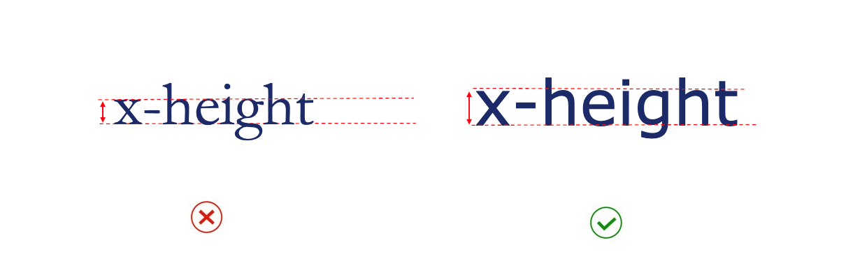
1. x-height 

Fonts with larger lowercase letters in proportion to uppercase letters are easier to read. To determine these proportions, you can measure the height of a lowercase ‘x’ in a typeface. This is called the ‘x-height’.  

The below image provides an example of two different typefaces, set at the same text size. The typeface shown on the right has a taller x-height with larger lowercase letters in proportion to uppercase letters. This makes it more legible than the font on the left. 
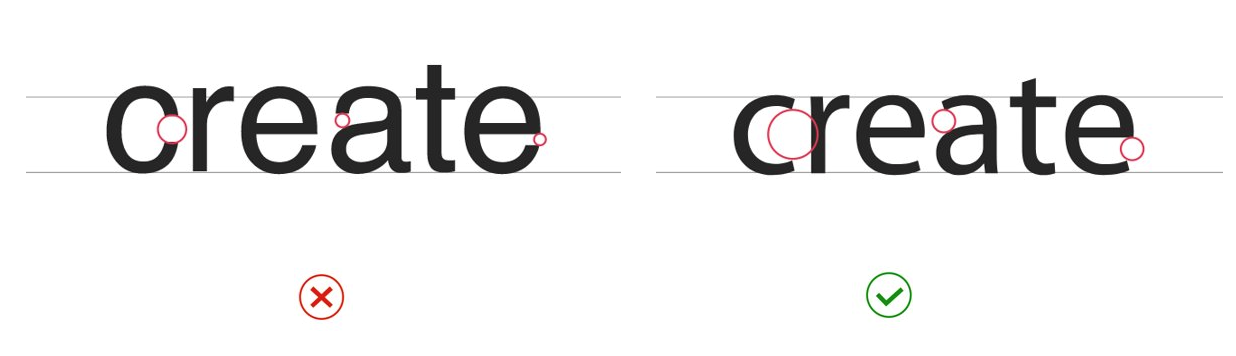
The word ‘x-height’ is shown in two typefaces (set at the same text size). The typeface shown on right has a taller x-height and is easier to read.
Image caption: The word ‘x-height’ is shown in two typefaces (set at the same text size). The typeface shown on right has a taller x-height and is easier to read.

2.  Aperture

The openings within a letter (like the gap in the curve of the letter ‘c’) are known as the ‘aperture’. Typefaces with larger apertures are usually more legible as it gives letters a unique and pronounced shape. 

The below image shows two typefaces set at the same text size. Red circles are used to highlight the apertures on the ‘c’, ‘a’ and ‘e’. The typeface on the right has more open apertures and is easier to read.

The word ‘create’ is shown in two typefaces (set at the same text size). Red circles are used to highlight the apertures (open space on the ‘c’, ‘a’ and ‘e’). The typeface on the right has more open apertures and is easier to read.
Image caption: The word ‘create’ is shown in two typefaces (set at the same text size). Red circles are used to highlight the apertures (open space on the ‘c’, ‘a’ and ‘e’). The typeface on the right has more open apertures and is easier to read.

How to fix this typography error:

  • Select typefaces that use a taller x-height. Georgia and Verdana are known for their generous x-heights and can be a good reference point to compare your font choices. 
  • Use typefaces with larger/more open apertures. Calibri and Verdana feature nice open apertures and are a good starting point. 

When comparing fonts at the same point size, those with larger x-heights and open apertures will be more readable on screen, especially for users with a visual or cognitive disability. 

Typography error #2: Typefaces with similar characters 

When letters can be mistaken for one another, they can be problematic for users with  vision conditions or cognitive barriers such as Dyslexia. For example, many fonts use the same or similar characters to depict a lowercase ‘l’, uppercase ‘I’ and number ‘1’.  

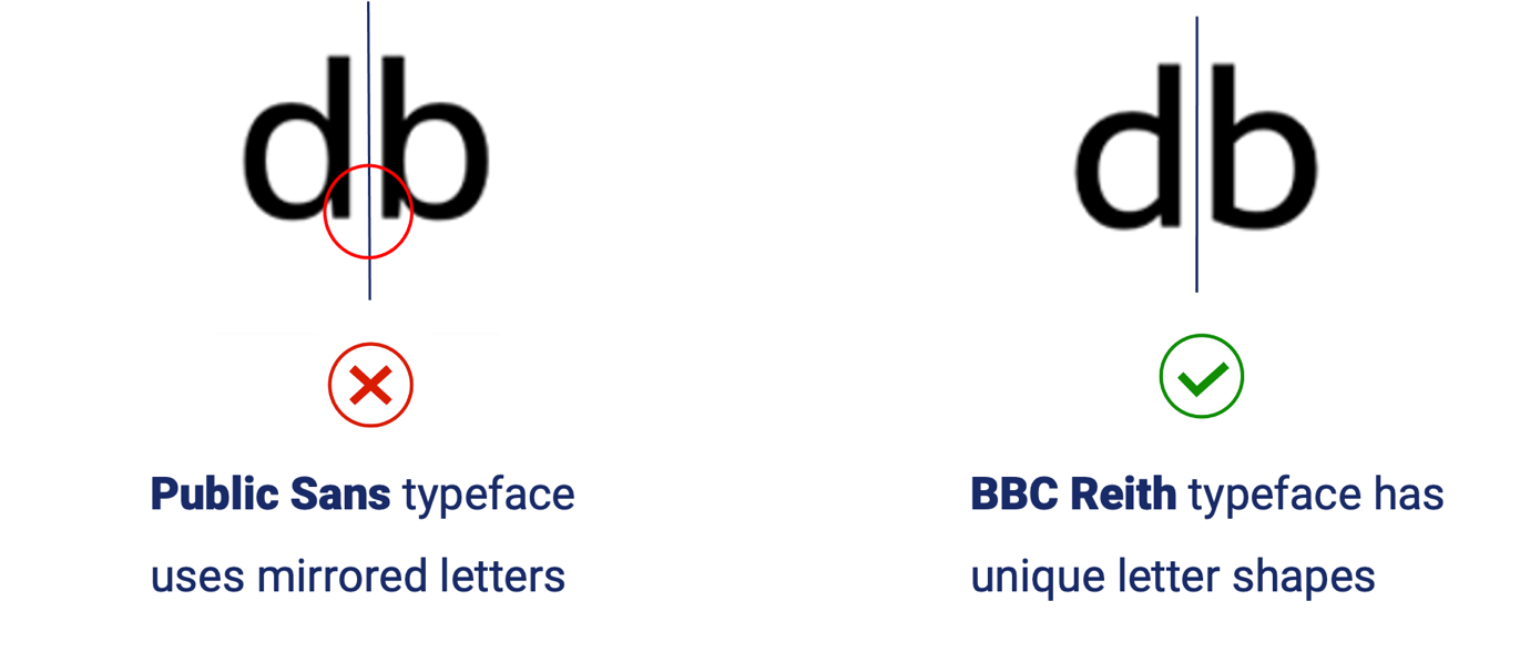
Letters that are identically mirrored can also be confusing for users with dyslexia — for example if a lowercase ‘b’ is the exact mirror of lowercase ‘d’. Slight variations, as pictured in the example below, can make these letters easier to distinguish. 

The characters ‘lowercase d’ and lowercase ‘b’ are shown in Public Sans typeface (on the left) and BBC Reith typeface (on the right).  A vertical line between the letters highlights that when set in Public Sans, the characters ‘d’ and ‘b’ are a mirror image of one another. The characters are unique and easily distinguishable when set in BBC Reith due to unique vertical strokes and curves within the letters.
Image caption: The characters ‘lowercase d’ and lowercase ‘b’ are shown in Public Sans typeface (on the left) and BBC Reith typeface (on the right).  A vertical line between the letters highlights that when set in Public Sans, the characters ‘d’ and ‘b’ are a mirror image of one another. The characters are unique and easily distinguishable when set in BBC Reith due to unique vertical strokes and curves within the letters.

How to fix this typography error: 

  • Use typefaces that have a clear differentiation between similar characters. Test out your font choices with a word like ‘millilitre’ or ‘1 million’ to check for similarities. The Verdana font is a good place to start. 
  • Check for mirroring in letters like lowercase d and b, or q and p. Use typefaces that have a slight variation. 

Typography error #3: Relying on colour to convey information 

When designing digital assets, the colour contrast of your font should be checked to meet accessibility requirements and W3C conformance. Another accessibility barrier to be wary of is relying on colour alone to convey important information, such as emphasising text.

For example, if you put highlight text in red to depict essential information — this message will be lost to users who are colour blind. 

How to fix this typography error: 

  • To avoid relying on colour alone, incorporate alternative cues into your designs. For typography, this could include bold text, underlining (for hyperlinks), or the use of icons. 
  • Alternative cues ensure everyone can perceive the information, regardless of their ability to see colour. You can learn more about alternative cues in our Making Colour Accessible course series

Where to learn more about accessible typography 

Simple typography errors could be preventing people from interacting with your business. When you remove barriers to access like hard-to-read fonts and colour cues, you can make your brand more welcoming and inclusive to everyone, regardless of background or ability.

For tips, tools and techniques to make your information easier to read, download the Accessible Typography Reference Guide.

To expand your knowledge and skills of digital accessibility, Digital Access also offers practical, on-demand training courses. From writing alt-text to colour accessibility, there are fast, practical courses to suit all content creators with more to come in 2024. 


Achieve your accessibility goals

If you would like to know more, contact one of our accessibility experts via email or subscribe to our newsletter for further insights and industry news.    

Explore Digital Access on-demand courses